
SIMPLICITY
Keep the design simple and easy to understand. A clutter-free logo is more memorable and versatile.
RELEVANCE
Ensure the logo reflects the essence of the brand or company it represents.
COLOUR
Choose colours that convey the desired emotions or traits associated with the brand.
A Journey of Delight
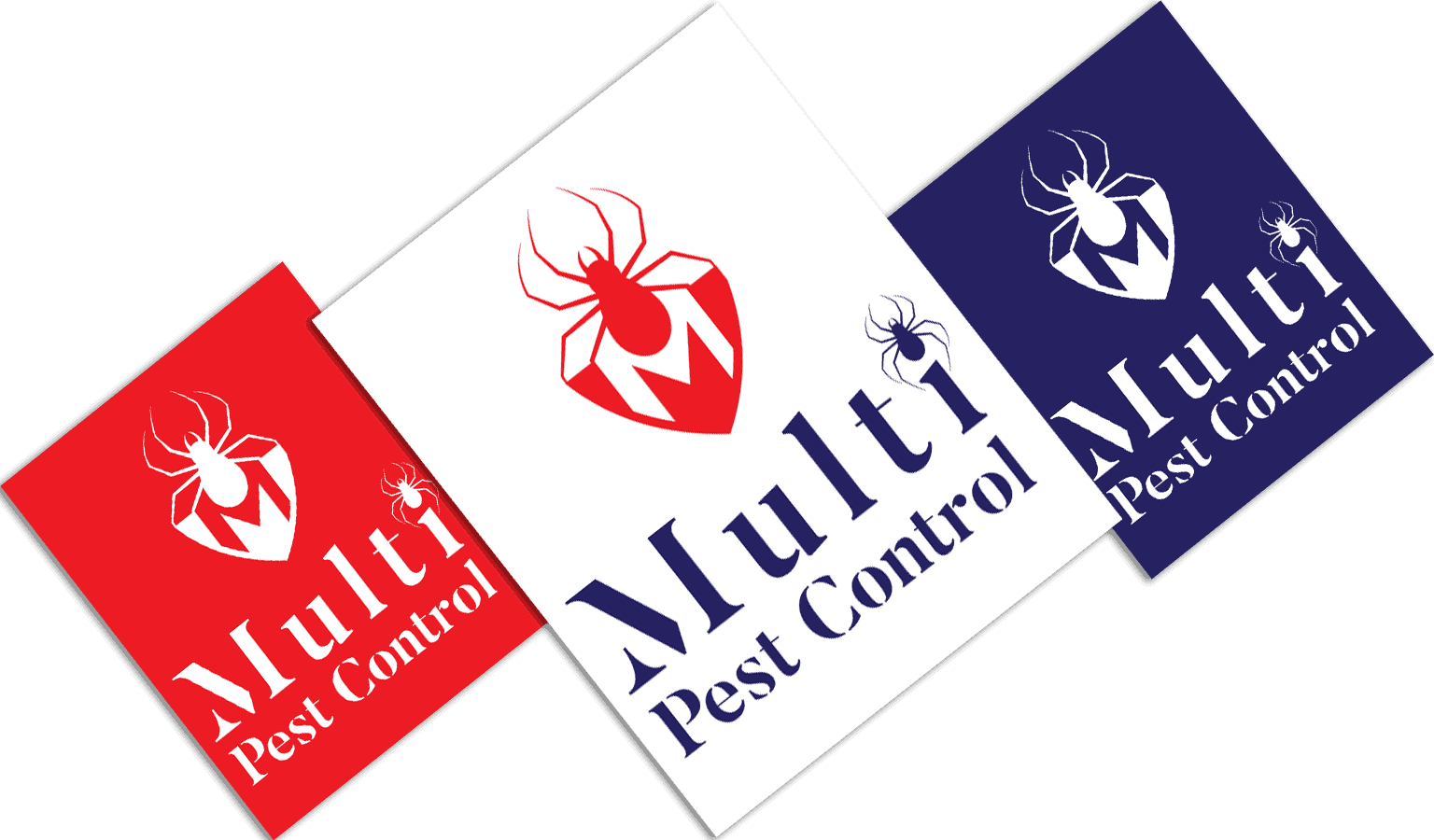
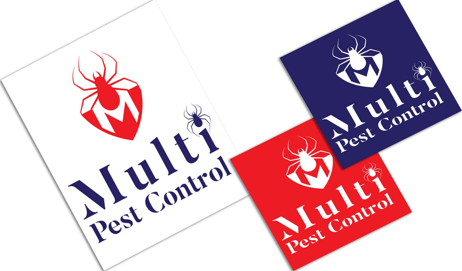
Icon Choice
The logo featured an iconic representation of common household pests arranged in a circular pattern. The inclusion of these pests emphasised the company's specialisation in dealing with a wide range of pest issues.
Colour Selection
The colour palette predominantly included shades of red and dark blue. Red symbolised urgency, action, and quick solutions—qualities desired in pest control services. Dark blue, on the other hand, represented trust, reliability, and professionalism, attributes that are essential in an industry where customers seek peace of mind.
Font Style
The chosen font was a combination of a modern sans-serif typeface for "Multi Pest," signifying efficiency and precision. For "Control," an elegant yet straightforward serif font was used, projecting a sense of reliability and experience.
TYPOGRAPHY
Select appropriate fonts that complement the logo's style and convey the right message.
Red
Red is often associated with danger, warning, and attention-grabbing, making it suitable for pest control. It emphasises the urgency of the issue and the immediate need for professional intervention.
Dark Blue
Dark blue signifies stability, trust, and expertise. In the pest control industry, where clients seek competent and dependable solutions, dark blue communicates Multi Pest Control's commitment to delivering effective services.

Increased Brand Recognition
The unique and memorable logo contributed to increased brand recognition. Potential clients could easily identify and associate the logo with pest control services.

Established Professionalism
The logo's design and colour choices conveyed professionalism, boosting the company's reputation in the market.

Boosted Customer Trust
The combination of red and dark blue inspired trust and confidence in potential customers. They felt assured of Multi Pest Control's ability to handle their pest-related concerns.

Positive Customer Perception
The revamped logo positively influenced customer perception of the brand, aligning it with reliability, efficiency, and quality services.